
Visually attractive and easy to read. It is the task of the layout designer to create a stylish magazine look. In addition to knowledge of the fundamentals of design, a Magazine Layout designer also requires some creativity.
Magazine Design has its own value. Basically, it's not just talking about the layout but it's also about what are the things that should be visualized in order to support the existing content.
Each magazine has its target audience and has a variety of different segments as well. In preparing a magazine layout we will need some adjustments of color selection, style illustration, font type and size, as well as language. Still, the main goal of the magazine is to communicate information to the audience, and it is something that must take precedence. Well that was some points I have gained from some magazine design experiences, some of them were fashion, lifestyle, and corporate magazine.
So, below are 30 stylish layout in magazine designs for your viewing pleasure.
1. BAR MAGAZINE designed by Marius Hanf
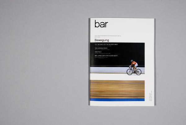
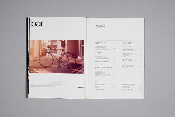

A mono Thematic magazine for bicycle: BAR focuses on long-term developments and emotions of the movement and around the wheel's why in our first issue of FOCUS: MOTION to understand a physical phenomenon of progress and a common philosophy of what unites us: the satisfaction of being part of a movement to be, for the true joy
2. Trendi Fashion Magazine designed by Lotta Nieminen

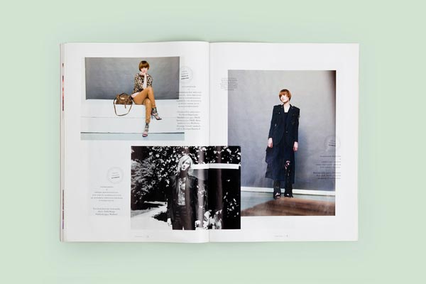

Layout redesign for Finnish monthly fashion magazine Trendi. Together with Leena Vainio. 2009?2010
3. Makeshift Magazine designed by Santos Henarejos


Makeshift is a quarterly magazine about creativity in unlikely places, from the favelas of Rio to the alleys of Delhi. These are environments where resources may be scarce, but where ingenuity is used incessantly for survival, enterprise, and a self-expression. Makeshift is about people, the things they make, and the context they make them in.
4. Red Esc?nica Magazine designed by Casmic Lab


First, second and third issue of Red Esc?nica. Scenic arts Magazine. This publication is the first of a collection that belongs to a European Project: Islands by net. Magazine about European experimental theatre scene.
5. Boom magazine designed by santhi thomaidi


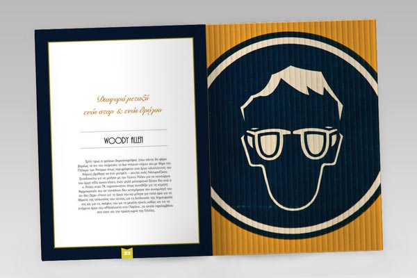
a study on editorial design: Boom magazine was a college projectwhich ended to be a study on editorial design and not a complete magazine. A series of covers, editorials and main articles.
6. Timotheus Magazine designed by Peter Voth

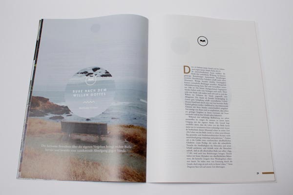

Editorial Design & Art Direction for Timotheus Magazine.
7. MUST / magazine designed by jekyll & hyde


Issue 18 of Must magazine is on sale in newsagents? now. We created the new graphic design for this fashion, design and lifestyle publication.? We were asked by ddn edizioni to rework the identity of the magazine. The desire is for it to continue to be a repository of lifestyles and a source of suggestions and reflections, but with a more sophisticated style.Using a modular outline with an emphasis on asymmetry, we created a series of crisp, clear page layouts in which the blank space is employed in the same way as the ?full? sections, giving breathing space to the composition. We completed the project by redesigning the masthead and the cover with the same elegant, contemporary style.
8. PORTFOLIO MAGAZINE designed by Frederico Cardoso

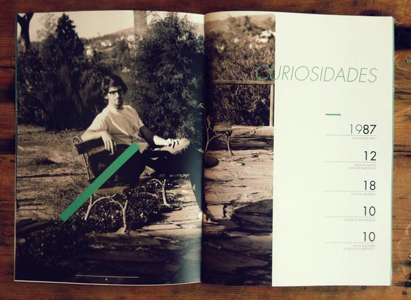

Another awesome example in art direction.
9. COFINA Magazine advertising designed by Julio Ferreira


Creative Advertising and post production work, produced at Tux&Gill for Cofina.
10. Journal LaSalle designed by Michael Feeney


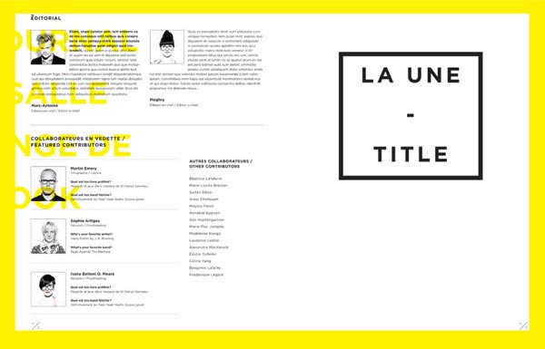
Magazine made for LaSalle College, a college in Montreal, well-known for its Fashion program.
11. L.A magazine LES AMBASSADEURS designed by Nicolas Zentner


The cover is a die cut L.A showing parts of an illustration by Brazilian artist Ana Anjos. L.A magazine, is for LES AMBASSADEURS, watch and Jewellery retailers in Switzerland
12. TERROIR Magazine designed by Benjamin Koh
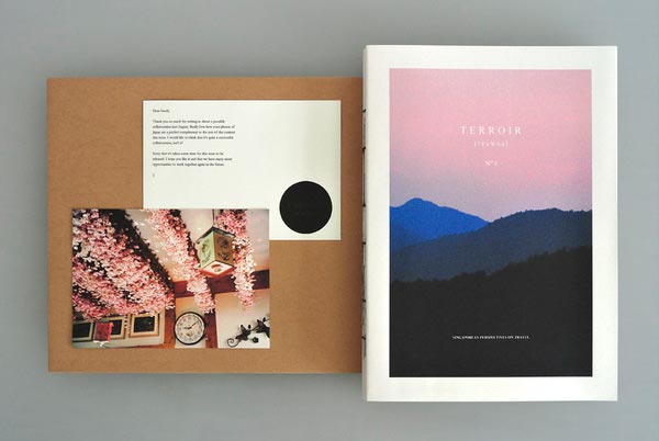
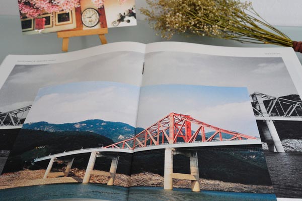

Printed on-demand with an inkjet printer using water-resistant pigment ink on 90gsm newsprint paper stock. 192 pages with three B6 inserts and a C5 insert. Terroir is a bespoke bi-annual magazine that seeks to collaborate with and showcase Singaporean perspectives on travel.
13. nevertheless magazine designed by atelier olschinsky


a magazine for places, spaces, art, work, people, projects, reading, writing, fashion, design, photo, graphic, illustration:
We observe, describe, quote and show but we can not interpret. Because we think that speak stories, facts and figures for yourself and even personalities are able to present themselves well.
14. kultmagazine designed by Viacheslav Abramov


15. Ferrari Magazine designed by Laurent Nivalle

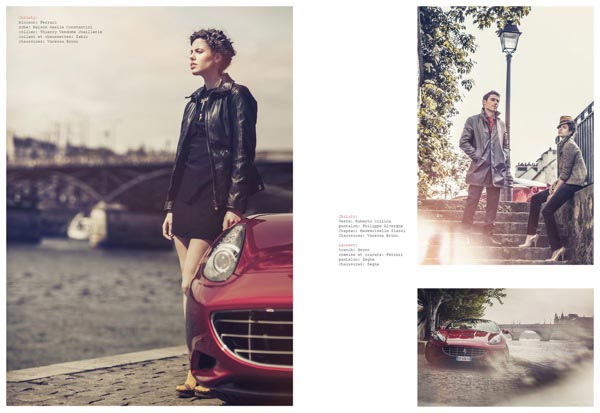
Automotive Design, Editorial Design, Fashion
photographer : Laurent Nivalle
stylism : Amaryllis Joskowicz
hair : Franck Nemoz
make up : Veronique Reina
16. Womens Health Magazine designed by S?rgio Bergocce

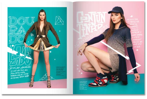
Illustrations/letterings to august issue of Womens Health Brazil Magazine
17. Jpeople Magazine designed by Stefan Lucut
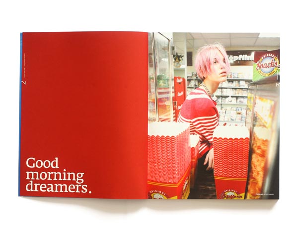

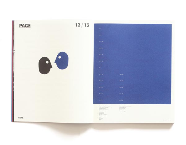
Dreams never end,It takes a lot of courage to show your dreams to someone else.
Erma Bombeck That is what we are doing in this issue. We are opening the magazine
with an insight into what dreams mean to us.So let us take you to another journey about Truth, Styles & Imagination.
18. Who's Jack Magazine ? Design & Art Direction designed by SAWDUST
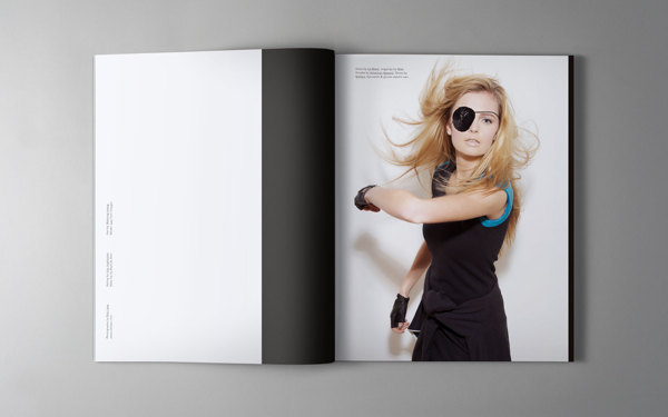
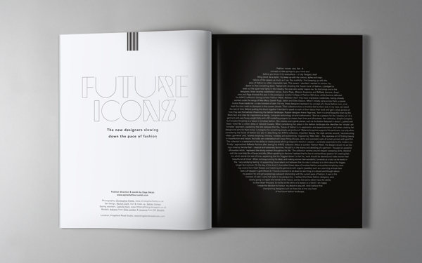
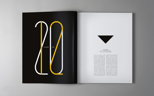
Redesign of Who?s Jack magazine. Art direction, design and custom typography by Sawdust.
19. DADI magazine designed by Nicolas Zentner
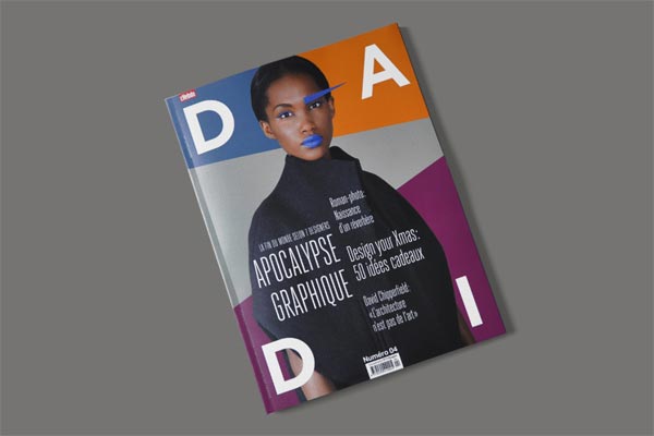
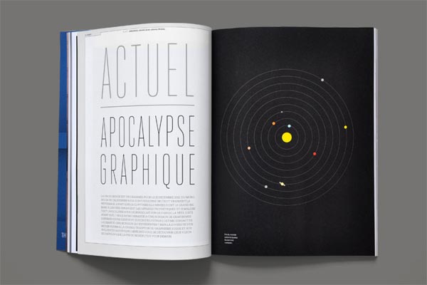

DADI magazine | Design, Art & Architecture, Decoration, Interior.
Cover & fashion photography: ? Annik Wetter, Hair & makeup: Julie Monot
20. .Get Inspired! Magazine designed by Andre Kreft

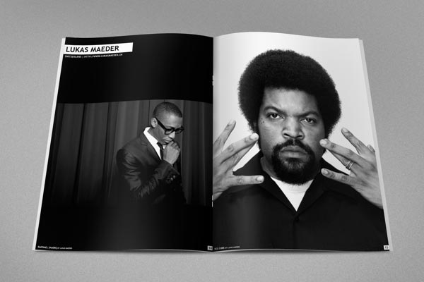
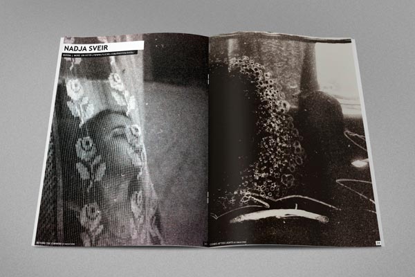
Great style and talent! And last showcase by Nick Frank with awesome architecture shots. Amazing colors and composition, big fan!
21. Multiply Magazine / Editorial designed by Dylsectic

Multiply is a new magazine, created to help and present the greek upcoming creative scene. It is formed by a team of young designers, photographers and journalists who believe that young creatives need their own distinctive way to develop.
The editorial, is based on a 2 to 3 column grid which changes according to the text content. The stuff we were given for the magazine?s body was mostly pictures so we chose to keep this percentage on the cover too.Also each issue will have some extra detail features depending on the field it presents. In the silkscreen printing issue, we designed the contents page as if it was transferred on a screen ready to be printed and we changed the page numbering from regular to limited, as if the pages were silkscreen posters.
22. Bleu Magazine designed by Squat Design


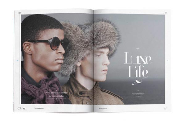
Squat Design, completely revamped and modeled a new look for men?s magazine Bleu. An amalgam of experiences and ideas expressed through fashion, entertainment, and culture,
Bleu embraces the ideal urban male of today and inspires him to surpass stereotypes
in exemplifying someone who is provocative, innovative and driven.
23. L.A magazine designed by Nicolas Zentner


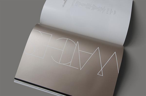
L.A magazine. Watch & Jewellery custom publishing
24. THE OUTPOST Magazine designed by Santos Henarejos
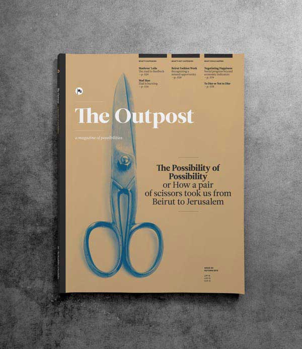
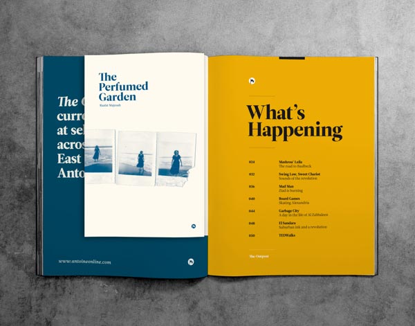
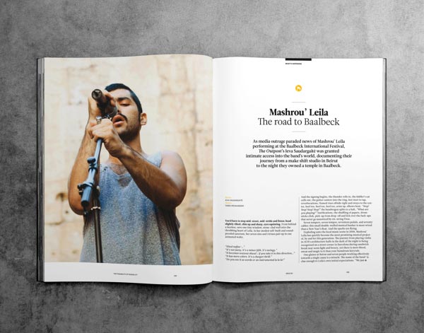
The Outpost is a magazine of possibilities. It identifies, understands and analyzes the conflicts, morals, energies and opportunities of a changing Middle East and lays down possible futures. It aims to ignite a socio-cultural renaissance in the Middle East through inspiring its readers to explore a world of possibilities.
The magazine is published four times a year from Beirut and is backed by a digital platform that hosts a weekly audio show. It has a general scope, a regional focus and a global outlook, and covers a wide range of stories that are meant to inform, inspire and entertain. It is forward looking and upholds an optimistic view on a world where possibilities are endless.
25. BILAN LUXE Magazine designed by Nicolas Zentner

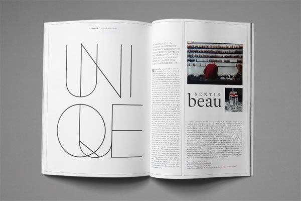

Bilan Luxe is a quarterly magazine published by Tamedia Switzerland
26. Solitaire magazine designed by Natalie Shau

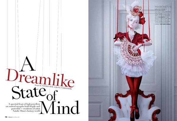

Inside illustrations mixed with jewelry editorial and magazine cover.
27. TASCHEN / Tapestry Magazine designed by Matt Edwards
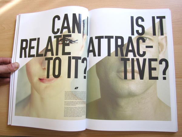


Tapestry magazine is a product that approaches and explores the subject of contemporary sexuality. It looks at the way that attitudes have changed, the importance of sex and the impact that technology has had on lifestyles not only in the present day, but also in the past and, just as importantly, in the future.The 220-page magazine is split into 24 chapters. Each dealing with a separate and relevant issue.
The idea with the overall design was to make each page interesting and informative while still maintaining the Tapestry brand ideals. I wanted it to have a page-turning quality that did not lose its appeal after a few pages.
I wanted the look of the magazine to align with the subject matter. Diversity, fun and entertainment.
28. Maverick Magazine designed by Anthony Neil Dart
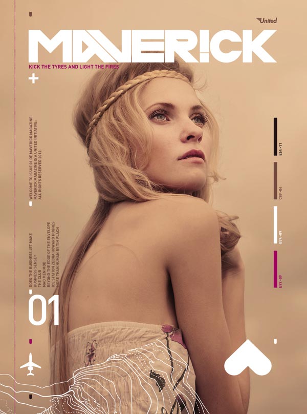


Covers and back covers and a selection of spreads.
29. NEVERTHELESS Magazine designed by atelier olschinsky

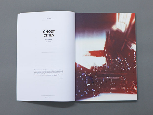
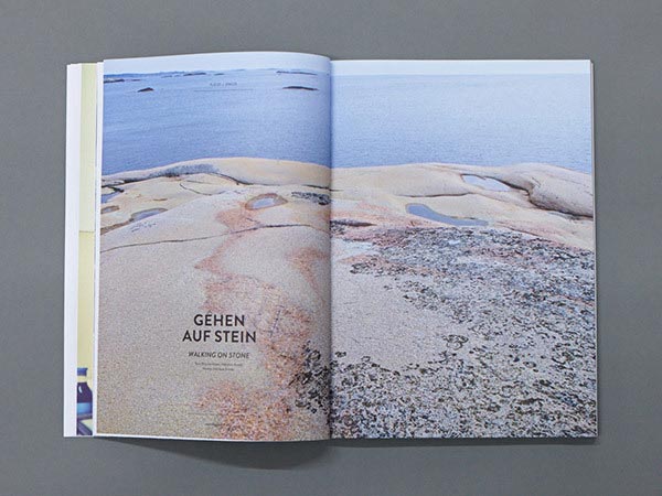
In this publication we wander through ghost towns, walk on rocks and ice, play with the rules of games, and indulge in sensuality. We are electrified, when we gaze at a yellow sky, cross a continent on a bycicle, kiss sleeping beauties awake, build bird houses, airplanes and harbors, enjoy the simplicity of complex things,
and are nevertheless constantly aware of the temporality of being.
30. LOLA Magazine designed by Pianofuzz
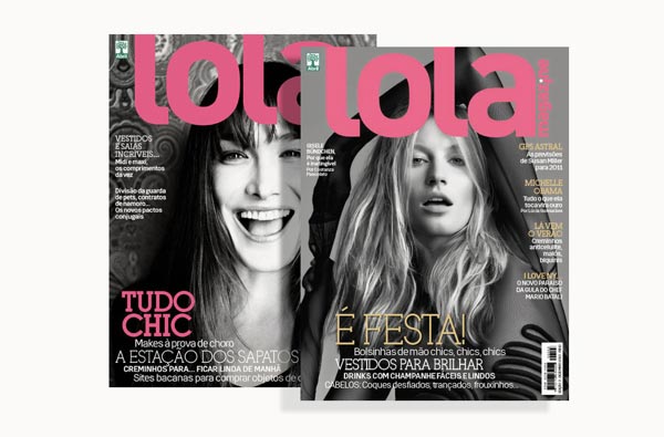

LOLA magazine, one of these publications, offers compelling content and seeks to contemplate the multiplicity of readers interests. Shows styles, histories and profiles under a vision that denote unique angles. The text has depth and humor, with the tone of a inspirational magazine.
Source: http://jayce-o.blogspot.com/2012/12/stylish-examples-layouts-magazine-design.html
critics choice awards 2012 colbert president huntingtons disease rob the firm new york philharmonic marines urinating on taliban
No comments:
Post a Comment